Directions
Once the data points are plotted, why bother connecting the dots? A graph of unconnected data points can also be called a scatter plot, and here’s what it would look like:
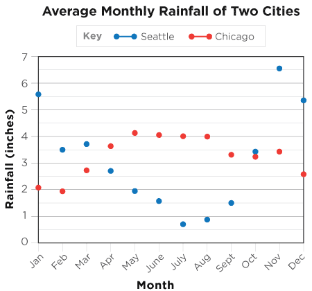
The plot can get messy, especially with more than one set of data. Connecting the dots to make a line graph is a way to draw out the patterns and trends buried in the data. In the graph on the right, instead of a scattering of dots, we can clearly see the changes over time in the slopes (the ups and downs) of the graph.
Source: National Climatic Data Center, 1981-2010 Climate Normals